The Electrocardiogram was invented by several scientists of which Professor Willem Einthoven from Leiden University in the Netherlands has been given the most credit. In an earlier blog we have elaborated on the interesting birth process of the ECG.
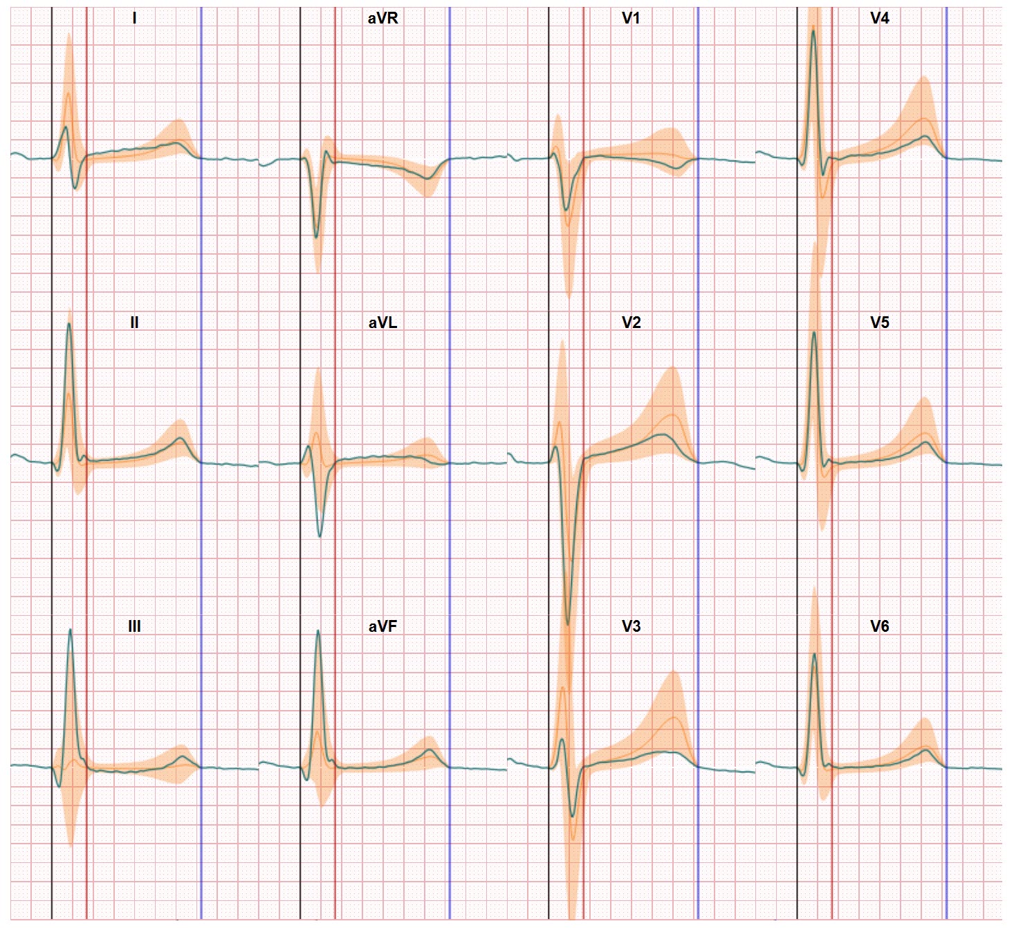
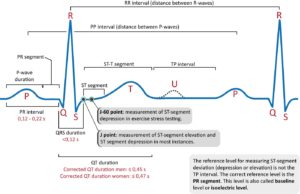
Einthoven also introduced the way we get the way we are presented with the ECG data. The ECG graph is probably one of the most used icons in the world to visualize a relationship with a clinical or medical phenomenon. The ECG graph shows the potential difference recorded by 2 electrodes placed on the skin during a certain time period. This can be as short as couple of seconds but can also be 72 hours or longer. If we use only 2 electrodes (like often the case in watches or bracelets) we have single graph. If we use more electrodes we can show more graphs because of the combinations possible between the electrodes. In a 12-lead ECG we place 10 electrodes on the skin and this results in 12 ECG graphs. Each combination of 2 electrodes shows the potential difference as a view on a specific view on the heart. This way a 12-lead ECG recording is converter in 12 different graphs. And the challenge of the physician is to interpret these 2 dimensional representations of the 3 dimensional heart activation process within the heart.
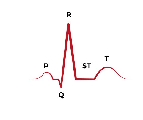
For over 100 years this ECG approach has been more or less the same. The ECG graphs can be presented in their cohort of 12 graphs or can be bundled in a single ECG graph. And we still use the marking annotation which was introduced by professor Einthoven to label the different segments and key turning points of the ECG graphs. Einthoven labeled them P, Q, R, S, T and the reason why he choose to start with P in the alphabet is one of the classic ECG mysteries.
The classic ECG view is a challenge
The ECG graph invented by Einthoven has remained an interpretation challenge over the years. Analyzing the heart rate and heart rhythm is relative easy since measuring the time between specific moments is doable. From the early days with calipers and today with algorithms. But ECG waveform interpretation is another issue. Due to uncertainties in both electrode positions and heart position & rotation it’s not clear where to position the graph base line. And this is important since the plus or minus value of the ECG waveform is the indication of the direction of the recorded electrical signal. This interpretation challenge is particular in play when the potential differences are small. Which unfortunately is the case most of the time in the ECG graph.
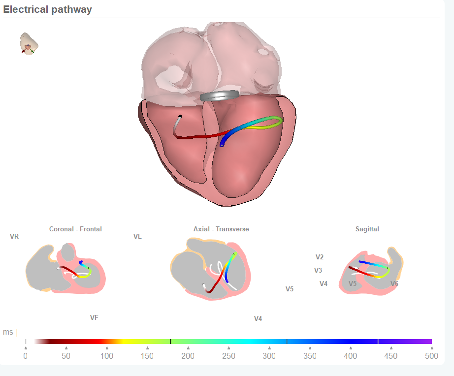
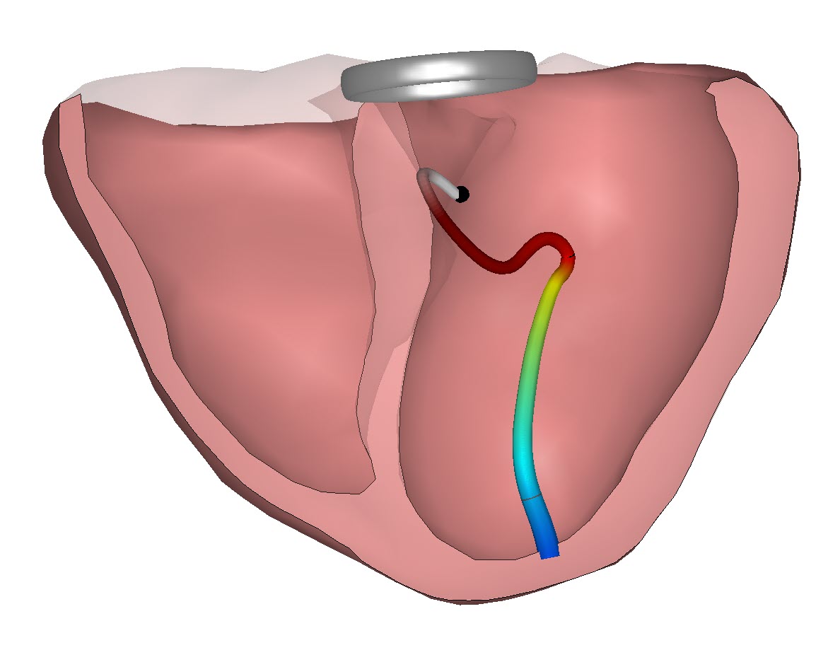
Our team has embraced the mission to bring the ECG in new views. And by going digital and relating the ECG data to the heart anatomy this its now possible to use new views. We can trace the mean electrical signal flowing through the heart and we can understand the direction and location of the mean signal at any moment in time. These new views only require 3 graphs presenting the spatial model (left-right | back-front | top-bottom). And this way this electrical pathway can be standardized and thus compared with the ECGs of healthy people. ECG based diagnostics are entering a new era made possible by presenting the ECG in new views.